How to create a logo: keys, step-by-step, and tools
How to create a logo: keys, step-by-step, and tools
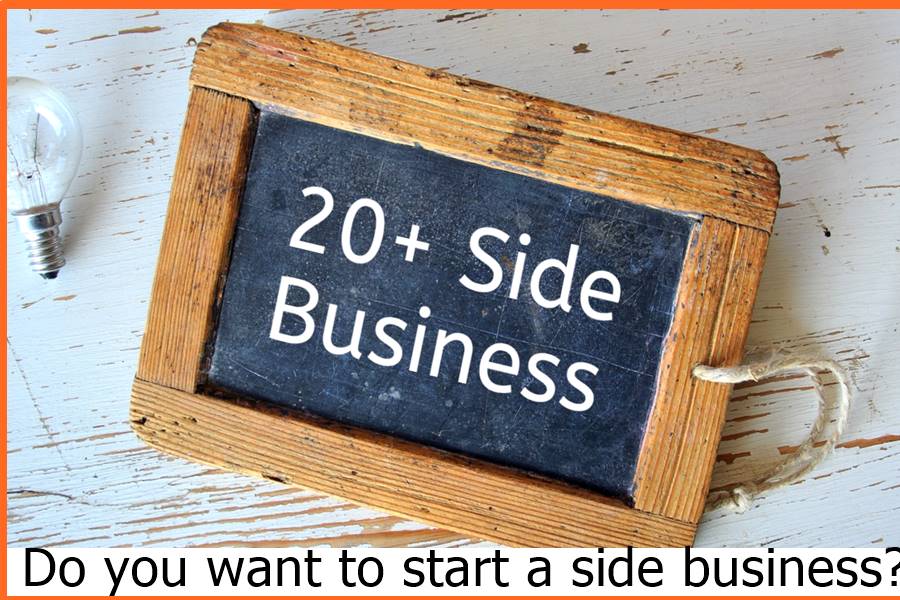
The design of your brand logo is key to developing your business. Today we teach you how to create a logo following the characteristics of the best, what steps to follow to design it, and the tools to do it. It’s time to create a unique and selling brand!
Find out before anyone else! Subscribe to the Tiendanube newsletter and receive weekly exclusive content on Marketing,
The importance of this visual element lies in the fact that it identifies and communicates a message symbolizing your brand.
It can be represented by text and an image, only a text or an image. The presence of the logo is capable of transforming the understanding that a person has about a company and adding value to the product or service offered.
Above all things, a professional and well-designed logo is a trusted thermometer and can often mean more or fewer sales.
This article will review the 5 key characteristics of creating a logo. The idea is that you apply it when building this important element of the visual identity of your online store.
In addition, we bring you a step-by-step on how to design a logo and a list of recommended tools to create the brand of your venture. Let us begin!
Key logo features with examples!
What is a logo? A logo is an image, text, or combination symbolizing a brand. This sign synthesizes and represents the identity of the business.
There are four types of logos:
- Logo: the brand’s name is written with its original typography. For example, Walt Disney’s:
- Isotype: The business is represented by a graphic symbol, such as a unique drawing or shape. For example, Apple:
- Image type: a combination of the sign and text with the name of the brand. For example, Cloud store:
- Isologo: composed of a fusion between the graphic symbol and the text, where the elements cannot be separated. For example, NASA:
With the clearest definition and typology, let’s move on to learn how to create a logo for a business. Here are the most important traits you need to adhere to:
- Plain
A simplicity-oriented design will make your logo easily adaptable, memorable, and long-lasting.
To achieve that goal, you must think about what kind of message you want to communicate to your audience. The idea is to focus on a specific idea so that it takes center stage and effectively reaches your potential customers. With your company’s purpose, I built your brand’s visual identity.
There are many good examples of simple logos that are unforgettable and easy to adapt. We can name Apple, Nike, Coca-Cola, Samsung, or Lacoste.
We will focus on the one that best reflects it: Google. Its logo brings simple typography and a great variety in the color wheel, communicating dynamism and flexibility. It is a company that constantly works to create innovative ideas and offers different products and services.
Ruth Kedar, the designer of this famous logo, spoke on an American online site about its origin. We share what she commented on the design:
“We decided to choose the primary colors (blue, red, and yellow), but instead of ordering them traditionally, we put a secondary color on the letter L (green), which gives us the idea that Google avoids following rules.”
- Memorable
An effective logo is easily remembered.
When we go down the street or browse social networks and see an advertisement, we usually spend very few seconds looking at the logo and understanding the brand. This contact has to generate a memorable experience.
Remember that the logo will be the synonym of your brand and must be recognized almost instantly.
An isotype logo that causes this sensation is that of Nike. It can be on a black background or any other color, but you will always recognize it.
In an interview with the British site Daily Mail, Carolyn Davidson, who designed the Nike logo in 1971, explained how the traditional symbol was born.
According to the graphic designer, the biggest challenge was producing something that conveyed movement, would look good on a pair of sneakers, and appeal to the company’s owners (who were impressed with the recently launched logo of rival Adidas).
Presenting the initial draft to the Nike co-founder, Carolyn said Phil Knight was not initially convinced but ultimately approved the material.
This is an inspiring story for everyone in the business right now. Sometimes an idea may seem bad; however, before discarding it, try to give it a second chance and listen to other points of view. You may have something amazing on your hands!
Of course, to get where Nike was, it took a lot more than a creative logo.
The company’s success, in addition to the competition, is related to a great investment in marketing and strengthening the brand. Without that, they may not have achieved as much, but without a doubt, getting the logo right is starting on the right foot.
- Durable
In addition to being simple and memorable, it is also important that your logo be enduring in history.
A logo should work for 20, 30, 50 years or even more. Making some specific adjustments over time will be necessary, but the essence must remain.
Over the last 40 years, we have changed our identity. We’re doing it again to stay relevant without losing our heritage. The mermaid will always have to be there. She is our soul.
This text is available on the Starbucks website and discusses the logo change in 2011. It has been around since 1971 and was changed 3 times throughout its history. However, he always retained his identity, which in this case is the design of a mermaid.
- Customizable
Simplicity is essential because it brings design versatility so that it can be adapted to multiple media.
For this reason, when analyzing the keys on how to create a logo, it is essential to bear in mind that it needs to be able to be applied to an infinite number of sizes, formats (printed or digital), and various materials (papers of different textures, bags, plastics, etc. ) depending on business requirements.
Therefore, before finalizing the logo design, try to ask yourself the following questions:
- Is my logo ready to be stamped in a single color? And in 2?
- Is it simple enough to print on the most varied materials and sizes (from a pen to a large banner)?
In the first point, we name Lacoste. After a quick internet search, we found an interesting article about the history of the charismatic crocodile that symbolizes the brand.
In the 1920s, Frenchman René Lacoste was one of the best tennis players in the world. At that time, however, tennis players used outdated clothing for the sport they performed (shoes, pants, and a kind of sweater).
The discomfort generated by the suits led René to adopt polo shirts as official clothing, quickly becoming a fashion among athletes. When he finished his degree in the early 1930s, he started the company that today is synonymous with excellence.
In the same period, he innovated with his style, and René earned the nickname “The Crocodile” from fans and the press. The exact reason for that nickname was never known, but it is believed to be due to his athleticism or a bet, as an article in GQ Magazine explains :
“The American press nicknamed him ‘El Yacaré’ in 1927 after he bet an alligator skin suitcase with the leader of the French team in the Davis Cup (the main tennis championship between countries). When he returned to France, ‘Yacaré’ had become ‘Crocodile,’ and years later Lacoste was forever known as the brand of the crocodile”.
Whether true or legendary, Lacoste’s history is interesting, and its logo is adaptable. We are used to seeing it printed in different types and sizes on t-shirts, shoes, perfumes, boxes, bags, etc.
- Appropriate
A good logo has to be designed to be relevant to your specific market segment and attractive to your target audience.
For example, children’s colors and fonts are excellent for children’s and adolescent stores. On the other hand, it would be better for a car brand.
At this point, we want to mention the Air Jordan sports products brand, which was born at the time of the greatest success of the basketball player, Michael Jordan. The company logo contemplates all the points already mentioned, and, in addition, it has the silhouette of the ex-athlete engraved after this move.
As you can see, the Air Jordan logo is straight to the point and epitomizes its target audience (basketball players and their fans). Looking at the logo, we already know what it is about.
However, you can give meaning to your logo without necessarily being obvious. As? The type of font (letter) used in the logo and the colors applied to it convey a message.
How to create a logo? Step by Step
The time has come to learn how to create a logo. We suggest you follow the next steps.
- Research and analyze the market.
This is the first point when starting a business. You must be clear about what industry you will dedicate yourself to, what target audience you will address, and what competing brands exist there.
All this analysis will provide you with valuable information to compose the corporate identity, the style, and its mission.
Brainstorm Brainstorming is an exercise that aims to enhance creativity and find solutions to specific situations.
As its name indicates, its purpose is to flow thoughts around a particular topic to develop creative ideas.
How to design a logo from brainstorming? After analyzing your market and competition, this practice will help you identify what type of design you want to create.
Making a logo for your business implies finding the key colors of its identity, style, tone, and brand voice.
- Select the color palette.
With your active creativity, surely you have thought about what colors you want to represent your brand.
At this point, it is important to talk about the psychology of color. This discipline within marketing studies what each tone transmits, what emotions it communicates, and what sensations it generates. Choosing your brand colors with this in mind will make it unforgettable!
7 characteristics to design a good logo today
The logo is one of the most important parts of any brand identity. Whether we start to design a logo or hire a graphic designer to do the task, these 7 characteristics will help you better assess whether the work done is on the right track.
Before beginning to explain everything in detail, we would like to clarify that these principles do not govern an exact science and that the best logo does not have to be the one that rigidly follows these principles but the one that is conceived taking into account the conditions of each situation . and of each company.
How to design a good logo? What features should it have?
- Simplicity
A good logo should be simple and not contain superficial decorative elements. It is a graphic “identifier” of an abstract concept such as a brand. It is not an image or illustration that should describe every aspect of your business. All superficial decorative elements that hinder the communication of a message, diverting attention from what is important must be eliminated. When designing a logo, “simplicity is the greatest sophistication.”
Fedex logo. It meets the Simplicity characteristic.
The Fedex logo design meets this first Simplicity characteristic very well. Also, looking at the space between the E and the X, you’ll notice a hidden arrow. According to the company, this arrow serves to symbolize the speed and precision of FedEx.
Simple logos are easier to remember, something we’ll cite below as just as important a feature.
- Originality
It must be original, easily remembered, and identifiable. By this, you should try to be different and unique compared to the other companies in your sector.
For example, if you have a catering kitchen, and your logo includes a spoon, your logo will not be too innovative.
- reflectivity
A good logo should capture the brand’s essence and reinforce its message. It must synthesize as much as possible the essence and personality of a brand. It must be faithful to the personality and identity that the brand represents. That is why we must place special emphasis when designing a good logo and refrain from taking paths or graphic resources that have nothing to do with the brand to represent.
Evolution of the Starbucks logo throughout the life of the company
Take the Starbucks mermaid logo as an example. The coffee company uses the mermaid as its main graphic identifier, which is closely linked to its history. The name “Starbucks” comes from the famous novel Moby Dick, while the company originates from Seattle, a city with a port. In addition, the company’s coffee often has to travel long distances by sea to reach its destination. The mermaid is a symbol that perfectly represents part of the essence of Starbucks.
How to create a logo: keys, step-by-step, and tools
- Scalability
A good logo must be reproducible at any size and adaptable to various formats. This feature is closely related to the simplicity of the logo. When we say that a logo must be scalable, we mean that it must be reproduced in various sizes without losing legibility: from a small embroidery to a sign at the entrance of any building. When making the smaller scales, they should be able to be read and seen well with their recognizable shapes.
A logo is overloaded with thousands of ornaments will have a very difficult time achieving this characteristic. If your logo has a font, paying attention to this detail and carrying out the tests that touch to guarantee correct scalability is important. Custom scripts are not a problem for this feature, but it is important to pay attention to the thickness of the stroke and that the letters or characters are not too close together. Our logo is a good example showing that custom lettering can have adequate scalability.
Another logo design that comes to mind when we talk about scalability would be Apple’s Apple. It was decided to include the famous bite of the apple for scalability. With the bite, it was guaranteed that it was more associated with an apple despite having a small proportion, and it was avoided being confused with a cherry or another small fruit.
How to create a logo: keys, step-by-step, and tools
- Pregnancy
Pregnancy is the ability of a visual form to capture attention and be remembered by people. A good logo must be memorable and leave a mark in the memory of whoever sees it. Once again, this feature is closely related to the first: simplicity. A very ornate logo contains too many elements to retain in memory.
The logos of Nike and Mcdonald’s have excellent Pregnancy.
There is a simple exercise with family and friends to study the Pregnancy of a logo. You can quote them all and show them the logo you have designed for a short period, say 10-15 seconds. After a few days, ask them to draw the logo shown on paper and assess how much they remember about it. A few days must pass since we are interested in long-term Pregnancy.
- Durability
With durability, we refer to your logo’s ability to endure over time, despite fashions or changes in the decade. Having to redesign a logo can be very confusing to your audience. If a company opts for a bad logo, it is likely that sooner or later, it will have to redesign it.
Coca-Cola logo design. Brewed in 1905
Coca-Cola is the best example of a logo that comes to mind as an optimal representative of the Durability characteristic. The original logo was designed in 1905, over 100 years ago, and has mostly stayed the same.
A logo should not be based on fashion; its design must respond to justified reasons. Sometimes it is difficult to put your subjectivity aside and try to have a critical eye. The best variant is not the one you like the most, but it is important always to make thoughtful decisions and strive to balance practicality and taste.
- Relevance
The design of your logo must be attractive to your target audience. That is why it is important that you know who the company is targeting and have a correctly defined audience profile. The appearance and finish of the logo design must always be fine and professional to reflect the solidity and solvency of the company.
Which credit card is better: Visa or Mastercard?
Fashion Packaging for Shoes in 2023
How to choose a gaming PC to enjoy at another level
Best Macbook Air 11 – Quality-Price 2023
How to create a logo: keys, step-by-step, and tools